In this notebook, we demonstrate the main statistical plots, tests and distributions In Euler. See the following reference for more information about the available functions.
Let us start with some descriptive statistics. This is not an introduction to statistics. So you might need some background to understand the details.
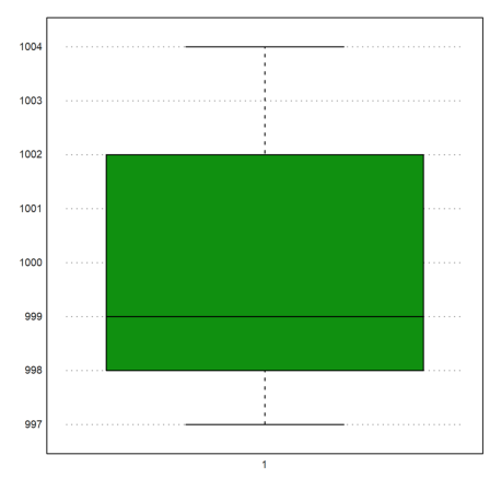
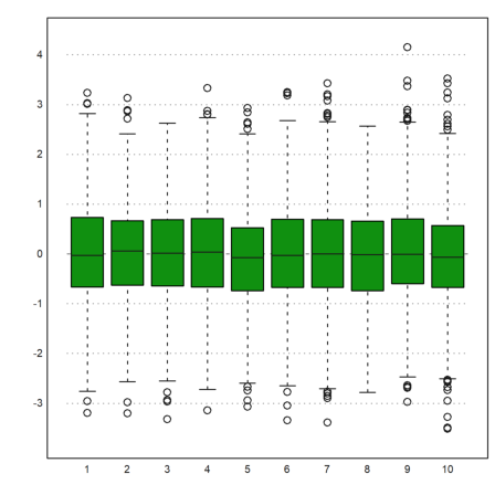
Assume the following measurements. We wish to compute the mean value and the measured standard deviation.
>M=[1000,1004,998,997,1002,1001,998,1004,998,997]; ...
 mean(M), dev(M),
999.9
2.72641400622
We can plot the box-and-whiskers plot for the data. In our case there are no outliers.
>boxplot(M):
We compute the probability that a value is bigger than 1005, assuming the measured values and a normal distribution.
All functions for distributions in Euler end with ...dis and compute the cumulative probability distribution (CPF).
We print the result in % with 2 digits accuracy using the print function.
>print((1-normaldis(1005,mean(M),dev(M)))*100,2,unit=" %")
3.07 %
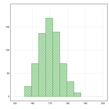
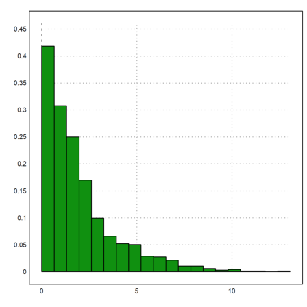
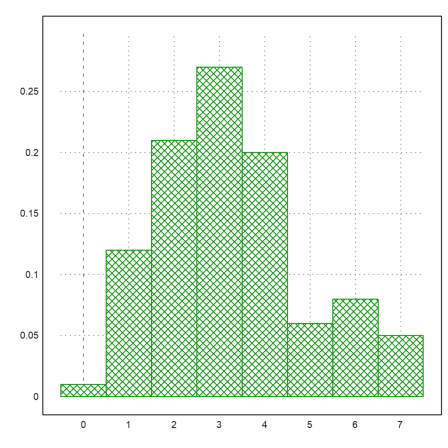
For the next example, we assume the following numbers of men in given a size ranges.
>r=155.5:4:187.5; v=[22,71,136,169,139,71,32,8];
Here is a plot of the distribution.
>plot2d(r,v,a=150,b=200,c=0,d=190,bar=1,style="\/"):
We can put such raw data into a table.
Tables are a method to store statistical data. Our table should contain three columns: Start of range, end of range, number of men in the range.
Tables can be printed with headers. We use a vector of strings to set the headers.
>T:=r[1:8]' | r[2:9]' | v'; writetable(T,labc=["from","to","count"])
      from        to     count
     155.5     159.5        22
     159.5     163.5        71
     163.5     167.5       136
     167.5     171.5       169
     171.5     175.5       139
     175.5     179.5        71
     179.5     183.5        32
     183.5     187.5         8
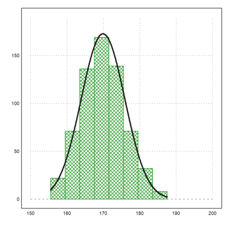
If we need the mean value and other statistics of the sizes, we need to compute the midpoint of the ranges. We can use the first two columns of our table for this.
>(T[,1]+T[,2])/2
        157.5
        161.5
        165.5
        169.5
        173.5
        177.5
        181.5
        185.5
But it is easier, to fold the ranges with the vector [1/2,1/2].
>l=fold(r,[0.5,0.5])
[157.5, 161.5, 165.5, 169.5, 173.5, 177.5, 181.5, 185.5]
Now we can compute the mean and deviation of the sample with the given frequencies.
>{m,d}=meandev(l,v); m, d,
169.901234568
5.98912964449
Let us add the normal distribution of the values to the plot.
>plot2d("qnormal(x,m,d)*sum(v)*4", ...
   xmin=min(r),xmax=max(r),thickness=3,add=1):
In the directory of this notebook you find a file with a table. The data represent the results of a survey. Here are the first four lines of the file. The data are from an German online book "Einführung in die Statistik mit R" by A. Handl.
>printfile("table.dat",4);
Person Sex Age Titanic Evaluation Tip Problem
1 m 30 n . 1.80 n
2 f 23 y g 1.80 n
3 f 26 y g 1.80 y
The table contains 7 columns of numbers or tokens (strings). We want read the table from the file. First, we use our own translation for the tokens.
Fo this, we define sets of tokens. The function strtokens() gets a string vector of tokens from a given string.
>mf:=["m","f"]; yn:=["y","n"]; ev:=strtokens("g vg m b vb");
Now we read the table with these translations.
The arguments tok2, tok4 etc. are the translations of the columns of the table. These arguments are not in the parameter list of readtable(), so you need to provide them with ":=".
>{MT,hd}=readtable("table.dat",tok2:=mf,tok4:=yn,tok5:=ev,tok7:=yn);
>load over statistics;
For printing, we need to specify the same token sets. We print the first four lines only.
>writetable(MT[1:4],labc=hd,wc=5,tok2:=mf,tok4:=yn,tok5:=ev,tok7:=yn);
 Person  Sex  Age Titanic Evaluation  Tip Problem
      1    m   30       n          .  1.8       n
      2    f   23       y          g  1.8       n
      3    f   26       y          g  1.8       y
      4    m   33       n          .  2.8       n
The dots "." represent values, which are not available.
If we do not want to specify the tokens for the translation in advance, we only need to specify, which columns contain tokens and not numbers.
>ctok=[2,4,5,7]; {MT,hd,tok}=readtable("table.dat",ctok=ctok);
The function readtable() now returns a set of tokens.
>tok
m
n
f
y
g
vg
The table contains the entries from the file with tokens translated to numbers.
The special string NA="." is interpreted as "Not Available", and gets NAN (not a number) in the table. This translation can be changed with the parameters NA, and NAval.
>MT[1]
[1, 1, 30, 2, NAN, 1.8, 2]
Here is the content of the table with untranslated numbers.
>writetable(MT,wc=5)
    1    1   30    2    .  1.8    2
    2    3   23    4    5  1.8    2
    3    3   26    4    5  1.8    4
    4    1   33    2    .  2.8    2
    5    1   37    2    .  1.8    2
    6    1   28    4    5  2.8    4
    7    3   31    4    6  2.8    2
    8    1   23    2    .  0.8    2
    9    3   24    4    6  1.8    4
   10    1   26    2    .  1.8    2
   11    3   23    4    6  1.8    4
   12    1   32    4    5  1.8    2
   13    1   29    4    6  1.8    4
   14    3   25    4    5  1.8    4
   15    3   31    4    5  0.8    2
   16    1   26    4    5  2.8    2
   17    1   37    2    .  3.8    2
   18    1   38    4    5    .    2
   19    3   29    2    .  3.8    2
   20    3   28    4    6  1.8    2
   21    3   28    4    1  2.8    4
   22    3   28    4    6  1.8    4
   23    3   38    4    5  2.8    2
   24    3   27    4    1  1.8    4
   25    1   27    2    .  2.8    4
For convenience, you can put the output of readtable() into a list.
>Table={{readtable("table.dat",ctok=ctok)}};
Using the same token columns and the tokens read from the file, we can print the table. We can either specify ctok, tok, etc. or use the list Table.
>writetable(Table,ctok=ctok,wc=5);
 Person  Sex  Age Titanic Evaluation  Tip Problem
      1    m   30       n          .  1.8       n
      2    f   23       y          g  1.8       n
      3    f   26       y          g  1.8       y
      4    m   33       n          .  2.8       n
      5    m   37       n          .  1.8       n
      6    m   28       y          g  2.8       y
      7    f   31       y         vg  2.8       n
      8    m   23       n          .  0.8       n
      9    f   24       y         vg  1.8       y
     10    m   26       n          .  1.8       n
     11    f   23       y         vg  1.8       y
     12    m   32       y          g  1.8       n
     13    m   29       y         vg  1.8       y
     14    f   25       y          g  1.8       y
     15    f   31       y          g  0.8       n
     16    m   26       y          g  2.8       n
     17    m   37       n          .  3.8       n
     18    m   38       y          g    .       n
     19    f   29       n          .  3.8       n
     20    f   28       y         vg  1.8       n
     21    f   28       y          m  2.8       y
     22    f   28       y         vg  1.8       y
     23    f   38       y          g  2.8       n
     24    f   27       y          m  1.8       y
     25    m   27       n          .  2.8       y
The function tablecol() returns the values of columns of the table, skipping any rows with NAN values("." in the file), and the indices of the columns, which contain these values.
>{c,i}=tablecol(MT,[5,6]);
We can use this to extract columns from the table for a new table.
>j=[1,5,6]; writetable(MT[i,j],labc=hd[j],ctok=[2],tok=tok)
    Person Evaluation       Tip
         2          g       1.8
         3          g       1.8
         6          g       2.8
         7         vg       2.8
         9         vg       1.8
        11         vg       1.8
        12          g       1.8
        13         vg       1.8
        14          g       1.8
        15          g       0.8
        16          g       2.8
        20         vg       1.8
        21          m       2.8
        22         vg       1.8
        23          g       2.8
        24          m       1.8
Of course, we need to extract the table itself from the list Table in this case.
>MT=Table[1];
Of course, we can also use it to determine the mean value of a column or any other statistical value.
>mean(tablecol(MT,6))
2.175
The getstatistics() function returns the elements in a vector, and their counts. We apply it to the "m" and "f" values in the second column of our table.
>{xu,count}=getstatistics(tablecol(MT,2)); xu, count,
[1,  3]
[12,  13]
We can print the result in a new table.
>writetable(count',labr=tok[xu])
         m        12
         f        13
The function selecttable() returns a new table with the values in one column selected from a vector of indices. First we look up the indices of two of our values in the token table.
>v:=indexof(tok,["g","vg"])
[5, 6]
Now we can select the rows of the table, which have any of the values in v in their 5-th row.
>MT1:=MT[selectrows(MT,5,v)]; i:=sortedrows(MT1,5);
Now we can print the table, with extracted and sorted values in the 5-th column.
>writetable(MT1[i],labc=hd,ctok=ctok,tok=tok,wc=7);
 Person    Sex    Age Titanic Evaluation    Tip Problem
      2      f     23       y          g    1.8       n
      3      f     26       y          g    1.8       y
      6      m     28       y          g    2.8       y
     18      m     38       y          g      .       n
     16      m     26       y          g    2.8       n
     15      f     31       y          g    0.8       n
     12      m     32       y          g    1.8       n
     23      f     38       y          g    2.8       n
     14      f     25       y          g    1.8       y
      9      f     24       y         vg    1.8       y
      7      f     31       y         vg    2.8       n
     20      f     28       y         vg    1.8       n
     22      f     28       y         vg    1.8       y
     13      m     29       y         vg    1.8       y
     11      f     23       y         vg    1.8       y
For the next statistic, we want to relate two columns of the table. So we extract column 2 and 4 and sort the table.
>i=sortedrows(MT,[2,4]);  ...
   writetable(tablecol(MT[i],[2,4])',ctok=[1,2],tok=tok)
         m         n
         m         n
         m         n
         m         n
         m         n
         m         n
         m         n
         m         y
         m         y
         m         y
         m         y
         m         y
         f         n
         f         y
         f         y
         f         y
         f         y
         f         y
         f         y
         f         y
         f         y
         f         y
         f         y
         f         y
         f         y
With getstatistics(), we can also relate the counts in two columns of the table to each other.
>MT24=tablecol(MT,[2,4]); ...
 {xu1,xu2,count}=getstatistics(MT24[1],MT24[2]); ...
 writetable(count,labr=tok[xu1],labc=tok[xu2])
                   n         y
         m         7         5
         f         1        12
A table can be written to a file.
>filename=eulerhome()+"test.dat"; ...
 writetable(count,labr=tok[xu1],labc=tok[xu2],file=filename);
Then we can read the table from the file.
>{MT2,hd,tok2,hdr}=readtable(filename,>clabs,>rlabs); ...
 writetable(MT2,labr=hdr,labc=hd)
                   n         y
         m         7         5
         f         1        12
And delete the file.
>fileremove(filename);
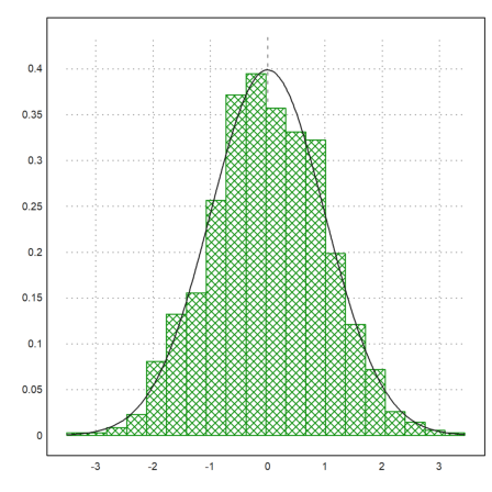
With plot2d, there is a very easy method to plot a distribution of experimental data.
>p=normal(1,1000); plot2d(p,distribution=20,style="\/"); ...
 plot2d("qnormal(x,0,1)",add=1):
Here is a comparison of 10 simulations of 1000 normal distributed values using a so-called box plot. This plot shows the median, the 25% and 75% quartiles, the minimal and maximal values, and the outliers.
>p=normal(10,1000); boxplot(p):
To generate random integers, Euler has intrandom. Let us simulate dice throws and plot the distribution.
We use the getmultiplicities(v,x) function, which counts how often the elements of v appear in x. Then we plot the the result using columnsplot().
>k=intrandom(1,6000,6);  ...
 columnsplot(getmultiplicities(1:6,k));  ...
 ygrid(1000,color=red):
While intrandom(n,m,k) returns uniformly distributed integers from 1 to k, it is possible to use any other given distribution of integers with randpint().
In the following example, the probabilities for 1,2,3 are 0.4,0.1,0.5 respectively.
>randpint(1,1000,[0.4,0.1,0.5]); getmultiplicities(1:3,%)
[378, 102, 520]
Euler can produce random values from more distributions. Have a look into the reference.
E.g., we try the exponential distribution.
>plot2d(randexponential(1,1000,2),>distribution):
For many distributions, Euler can compute the distribution function and the inverse.
>plot2d("normaldis",-4,4):
The following is one way to plot a quantile.
>plot2d("qnormal(x,1,1.5)",-4,6);  ...
 plot2d("qnormal(x,1,1.5)",a=2,b=5,>add,>filled):
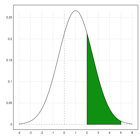
The probability to be in the green area is the following.
>normaldis(5,1,1.5)-normaldis(2,1,1.5)
0.248662156979
This can be computed numerically with the following integral.
>gauss("qnormal(x,1,1.5)",2,5)
0.248662156979
Let us compare the binomial distribution with the normal distribution of same mean and deviation. The function invbindis() solves a linear interpolation between integer values.
>invbindis(0.95,1000,0.5), invnormaldis(0.95,500,0.5*sqrt(1000))
525.516721219
526.007419394
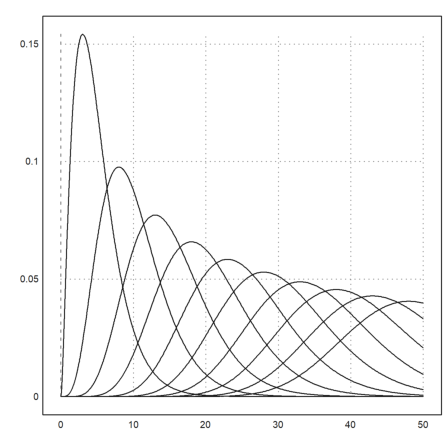
The function qdis() is the density of the chi-square distribution. As usual, Euler maps vectors to this function. Thus we get a plot of all chi-square distributions with degrees 5 to 30 easily in the following way.
>plot2d("qchidis(x,(5:5:50)')",0,50):
Euler has accurate functions to evaluate distributions. Let us check chidis() with an integral.
The naming tries to be consistent. E.g.,
The complements of the distribution (upper tail) is chicdis().
>chidis(1.5,2), integrate("qchidis(x,2)",0,1.5)
0.527633447259
0.527633447259
To define your own discrete distribution, you can use the following method.
First we set the distribution function.
>wd = 0|((1:6)+[-0.01,0.01,0,0,0,0])/6
[0, 0.165, 0.335, 0.5, 0.666667, 0.833333, 1]
The meaning is that with probability wd[i+1]-wd[i] we produce the random value i.
This is almost a uniform distribution. Let us define a random number generator for this. The find(v,x) function finds the value x in the vector v. It works for vectors x too.
>function wrongdice (n,m) := find(wd,random(n,m))
The error is so subtle that we see it only with very many iterations.
>columnsplot(getmultiplicities(1:6,wrongdice(1,1000000))):
Here is a simple function to check for uniform distribution of the values 1...K in v. We accept the result, if for all frequencies
![]()
>function checkrandom (v, delta=1) ...
   K=max(v); n=cols(v);
   fr=getfrequencies(v,1:K);
   return max(fr/n-1/K)<delta/sqrt(n);
   endfunction
Indeed the function rejects the uniform distribution.
>checkrandom(wrongdice(1,1000000))
0
And it accepts the built-in random generator.
>checkrandom(intrandom(1,1000000,6))
1
We can compute the binomial distribution. First there is binomialsum(), which returns the probability of i or less hits out of n trials.
>bindis(410,1000,0.4)
0.751401349654
The inverse Beta function is used to compute a Clopper-Pearson confidence interval for the parameter p. The default level is alpha.
The meaning of this interval is that if p is outside the interval, the observed result of 410 in 1000 is rare.
>clopperpearson(410,1000)
[0.37932, 0.441212]
The following commands are the direct way to get the above result. But for large n, the direct summation is not accurate and slow.
>p=0.4; i=0:410; n=1000; sum(bin(n,i)*p^i*(1-p)^(n-i))
0.751401349655
By the way, invbinsum() computes the inverse of binomialsum().
>invbindis(0.75,1000,0.4)
409.932733047
In Bridge, we assume 5 outstanding cards (out of 52) in two hands (26 cards). Let us compute the probability of a distribution worse than 3:2 (e.g. 0:5, 1:4, 4:1 or 5:0).
>2*hypergeomsum(1,5,13,26)
0.321739130435
There is also a simulation of multinomial distributions.
>randmultinomial(10,1000,[0.4,0.1,0.5])
          381           100           519
          376            91           533
          417            80           503
          440            94           466
          406           112           482
          408            94           498
          395           107           498
          399            96           505
          428            87           485
          400            99           501
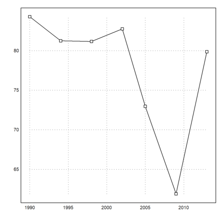
To plot data, we try the results of the German elections since 1990, measured in seats.
>BW := [ ...
 1990,662,319,239,79,8,17; ...
 1994,672,294,252,47,49,30; ...
 1998,669,245,298,43,47,36; ...
 2002,603,248,251,47,55,2; ...
 2005,614,226,222,61,51,54; ...
 2009,622,239,146,93,68,76; ...
 2013,631,311,193,0,63,64];
For the parties, we use a string of names.
>P:=["CDU/CSU","SPD","FDP","Gr","Li"];
Let us print the percentages nicely.
First we extract the necessary columns. Columns 3 to 7 are the seats of each party, and column 2 is the total number of seats. column is the year of the election.
>BT:=BW[,3:7]; BT:=BT/sum(BT); YT:=BW[,1]';
Then we print the statistics in table form. We use the names as column headers, and the years as headers for the rows. The default width for the columns is wc=10, but we prefer a denser output. The columns will be expanded for the labels of the columns, if necessary.
>writetable(BT*100,wc=6,dc=0,>fixed,labc=P,labr=YT)
       CDU/CSU   SPD   FDP    Gr    Li
  1990      48    36    12     1     3
  1994      44    38     7     7     4
  1998      37    45     6     7     5
  2002      41    42     8     9     0
  2005      37    36    10     8     9
  2009      38    23    15    11    12
  2013      49    31     0    10    10
The following matrix multiplication extracts the sum of the percentages of the two big parties showing that the small parties have gained footage in the parliament until 2009.
>BT1:=(BT.[1;1;0;0;0])'*100
[84.29, 81.25, 81.1659, 82.7529, 72.9642, 61.8971, 79.8732]
There is also a simple statistical plot. We use it to display lines and points simultaneously. The alternative is to call plot2d twice with >add.
>statplot(YT,BT1,"b"):
Define some colors for each party.
>CP:=[rgb(0.5,0.5,0.5),red,yellow,green,rgb(0.8,0,0)];
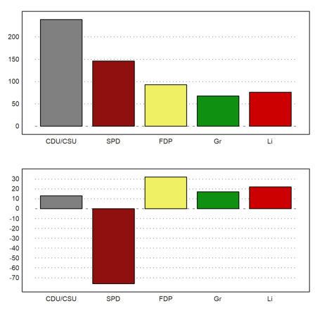
Now we can plot the results of the 2009 election and the changes into one plot using figure. We can add a vector of columns to each plot.
>figure(2,1);  ...
 figure(1); columnsplot(BW[6,3:7],P,color=CP); ...
 figure(2); columnsplot(BW[6,3:7]-BW[5,3:7],P,color=CP);  ...
 figure(0):
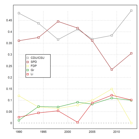
Data plots combine rows of statistical data in one plot.
>J:=BW[,1]'; DP:=BW[,3:7]'; ...
 dataplot(YT,BT',color=CP);  ...
 labelbox(P,colors=CP,styles="[]",>points,w=0.2,x=0.3,y=0.4):
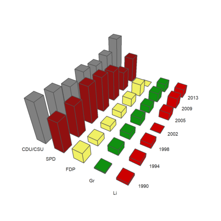
A 3D columns plot shows rows of statistical data in form of columns. We provide labels for the rows and the columns. angle is the viewing angle.
>columnsplot3d(BT,scols=P,srows=YT, ...
   angle=30°,ccols=CP):
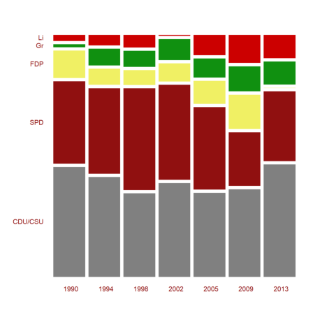
Another representation is the mosaic plot. Note that the columns of the plot represent the columns of the matrix here. Because of the length of the label CDU/CSU, we take a smaller window than usual.
>shrinkwindow(>smaller);  ...
 mosaicplot(BT',srows=YT,scols=P,color=CP,style="#"); ...
 shrinkwindow():
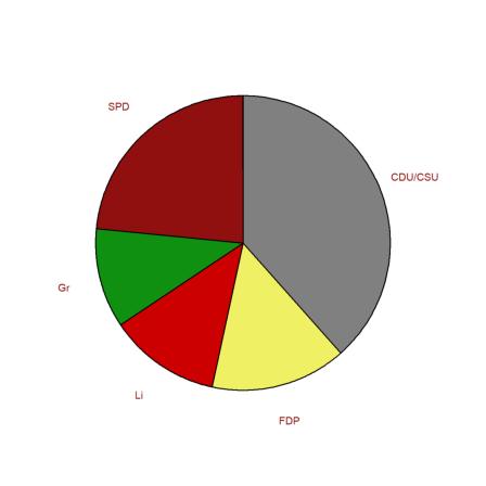
We can also do a pie chart. Since black and yellow form a coalition, we reorder the elements.
>i=[1,3,5,4,2]; piechart(BW[6,3:7][i],color=CP[i],lab=P[i]):
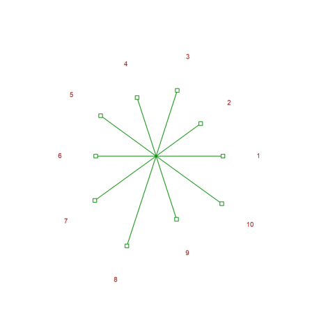
Here is another kind of plot.
>starplot(normal(1,10)+4,lab=1:10,>rays):
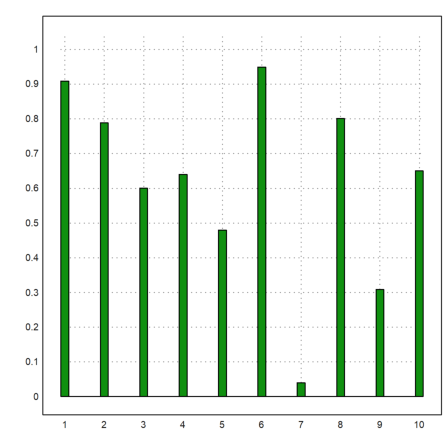
Some plots in plot2d are good for statics. Here is an impulse plot of random data, uniformly distributed in [0,1].
>plot2d(makeimpulse(1:10,random(1,10)),>bar):
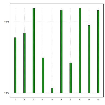
But for exponentially distributed data, we may need a logarithmic plot.
>logimpulseplot(1:10,-log(random(1,10))*10):
The function columnsplot() is easier to use, since it needs just a vector of values. Moreover, it can set its labels to anything we want, we demonstrated this already in this tutorial.
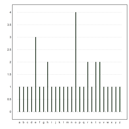
Here is another application, where we count characters in a sentence and plot a statistics.
>v=strtochar("the quick brown fox jumps over the lazy dog"); ...
 w=ascii("a"):ascii("z"); x=getmultiplicities(w,v); ...
 cw=[]; for k=w; cw=cw|char(k); end; ...
 columnsplot(x,lab=cw,width=0.05):
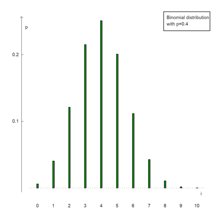
It is also possible to manually set axes.
>n=10; p=0.4; i=0:n; x=bin(n,i)*p^i*(1-p)^(n-i); ...
 columnsplot(x,lab=i,width=0.05,<frame,<grid); ...
 yaxis(0,0:0.1:1,style="->",>left); xaxis(0,style="."); ...
 label("p",0,0.25), label("i",11,0); ...
 textbox(["Binomial distribution","with p=0.4"]):
The following is a way to plot the frequencies of numbers in a vector.
We create a vector of integer random numbers 1 to 6.
>v:=intrandom(1,10,10)
[8, 5, 8, 8, 6, 8, 8, 3, 5, 5]
Then extract the unique numbers in v.
>vu:=unique(v)
[3, 5, 6, 8]
And plot the frequencies in a columns plot.
>columnsplot(getmultiplicities(vu,v),lab=vu,style="/"):

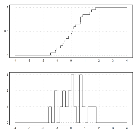
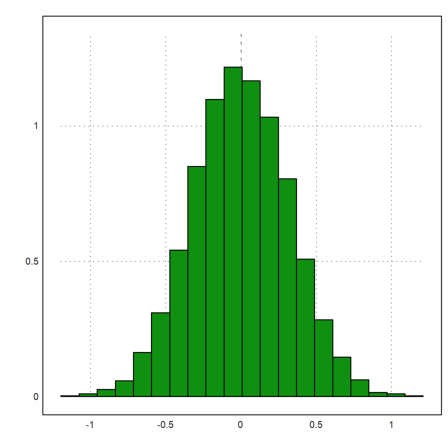
We want to demonstrate functions for the empirical distribution of values.
>x=normal(1,20);
The function empdist(x,vs) needs a sorted array of values. So we have to sort x before we can use it.
>xs=sort(x);
Then we plot the empirical distribution and some density bars into one plot. Instead of a bar plot for the distribution we use a sawtooth plot this time.
>figure(2,1); ...
 figure(1); plot2d("empdist",-4,4;xs); ...
 figure(2); plot2d(histo(x,v=-4:0.2:4,<bar));  ...
 figure(0):
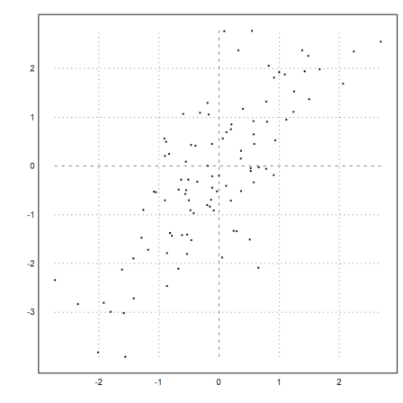
A scatter plot is easy to do in Euler with the usual point plot. The following graph shows that the X and X+Y are clearly positively correlated.
>x=normal(1,100); plot2d(x,x+rotright(x),>points,style=".."):
Often, we wish to compare two samples of different distributions. This can be done with a quantile-quantile-plot.
For a test, we try the student-t distribution and exponential distribution.
>x=randt(1,1000,5); y=randnormal(1,1000,mean(x),dev(x)); ...
 plot2d("x",r=6,style="--",yl="normal",xl="student-t",>vertical); ...
 plot2d(sort(x),sort(y),>points,color=red,style="x",>add):
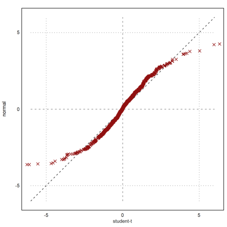
The plot clearly shows that the normal distributed values tend to be smaller at the extreme ends.
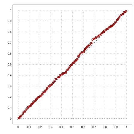
If we have two distributions of different size, we can expand the smaller one or shrink the larger one. The following function is good for both. It takes the median values with percentages between 0 and 1.
>function medianexpand (x,n) := median(x,p=linspace(0,1,n-1));
Let us compare two equal distributions.
>x=random(1000); y=random(400); ...
 plot2d("x",0,1,style="--"); ...
 plot2d(sort(medianexpand(x,400)),sort(y),>points,color=red,style="x",>add):
For another example we read a survey of students, their ages, the ages of their parents and the number of siblings from a file.
This table contains "m" and "f" in the second column. We use the variable tok2 to set the proper translations instead of letting readtable() collect the translations.
>{MS,hd}:=readtable("table1.dat",tok2:=["m","f"]);  ...
 writetable(MS,labc=hd,tok2:=["m","f"]);
    Person       Sex       Age    Mother    Father  Siblings
         1         m        29        58        61         1
         2         f        26        53        54         2
         3         m        24        49        55         1
         4         f        25        56        63         3
         5         f        25        49        53         0
         6         f        23        55        55         2
         7         m        23        48        54         2
         8         m        27        56        58         1
         9         m        25        57        59         1
        10         m        24        50        54         1
        11         f        26        61        65         1
        12         m        24        50        52         1
        13         m        29        54        56         1
        14         m        28        48        51         2
        15         f        23        52        52         1
        16         m        24        45        57         1
        17         f        24        59        63         0
        18         f        23        52        55         1
        19         m        24        54        61         2
        20         f        23        54        55         1
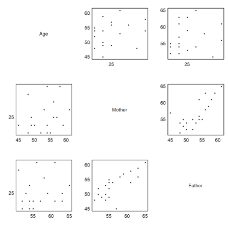
How do the ages depend on each other? A first impression comes from a pairwise scatterplot.
>scatterplots(tablecol(MS,3:5),hd[3:5]):
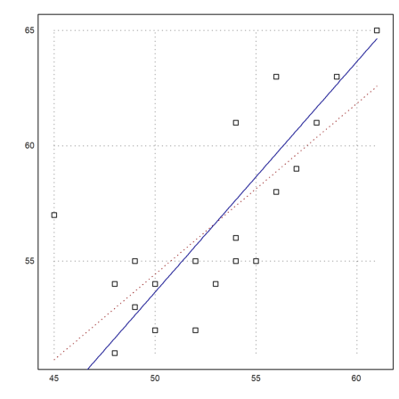
It is clear that the age of the father and mother depend on each other. Let us determine and plot the regression line.
>cs:=MS[,4:5]'; ps:=polyfit(cs[1],cs[2],1)
[17.3789, 0.740964]
This is obviously the wrong model. The regression line would be s=17+0.74t, where t is the age of the mother and s the age of the father. The age difference may depend a little bit on the age, but not that much.
Rather, we suspect a function like s=a+t. Then a is the mean of the s-t. It is the average age difference between fathers and mothers.
>da:=mean(cs[2]-cs[1])
3.65
Let us plot this into one scatter plot.
>plot2d(cs[1],cs[2],>points);  ...
 plot2d("evalpoly(x,ps)",color=red,style=".",>add);  ...
 plot2d("x+da",color=blue,>add):
Here is a box plot of the two ages. This only shows, that the ages are different.
>boxplot(cs,["mothers","fathers"]):
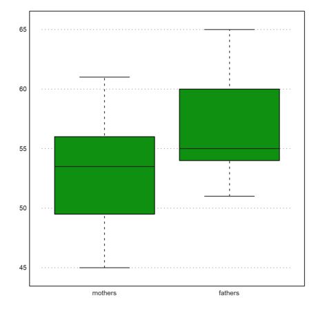
It is interesting that the difference in medians is not as large as the difference in means.
>median(cs[2])-median(cs[1])
1.5
The correlation coefficient suggests a positive correlation.
>correl(cs[1],cs[2])
0.7588307236
The correlation of the ranks is a measure for the same order in both vectors. It is also quite positive.
>rankcorrel(cs[1],cs[2])
0.758925292358
Of course, the EMT language can be used to program new functions. E.g., we define the skewness function.
![]()
where m is the mean of x.
>function skew (x:vector) ...
 m=mean(x);
 return sqrt(cols(x))*sum((x-m)^3)/(sum((x-m)^2))^(3/2);
 endfunction
As you see, we can easily use the matrix language to get a very short and efficient implementation. Let us try this function.
>data=normal(20); skew(normal(10))
-0.198710316203
Here is another function, called the Pearson skewness coefficient.
>function skew1 (x) := 3*(mean(x)-median(x))/dev(x)
>skew1(data)
-0.0801873249135
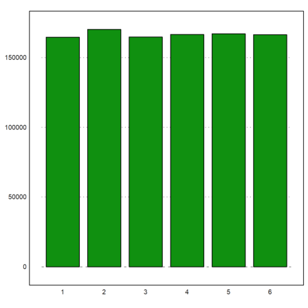
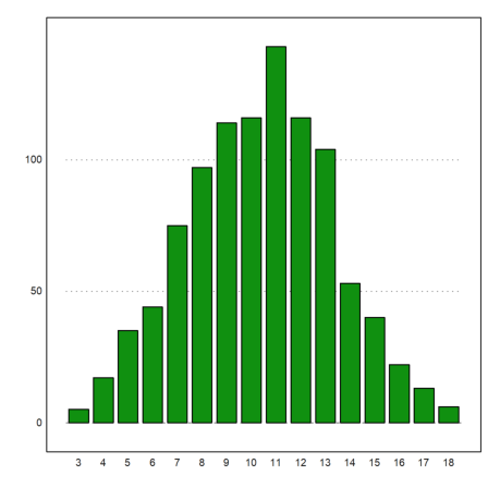
Euler can be used to simulate random events. We have already seen simple examples above. Here is another one, which simulates 1000 times 3 dice throws, and asks for the distribution of the sums.
>ds:=sum(intrandom(1000,3,6))'; fs=getmultiplicities(3:18,ds)
[5,  17,  35,  44,  75,  97,  114,  116,  143,  116,  104,  53,  40,
22,  13,  6]
We can plot this now.
>columnsplot(fs,lab=3:18):
To determine the expected distribution is not so easy. We use an advanced recursion for this.
The following function counts the number of ways the number k can be represented as the sum of n numbers in the range of 1 to m. It works recursively in an obvious way.
>function map countways (k; n, m) ...
   if n==1 then return k>=1 && k<=m
   else
     sum=0;
     loop 1 to m; sum=sum+countways(k-#,n-1,m); end;
     return sum;
   end;
 endfunction
Here is the result for three throws of dices.
>cw=countways(3:18,3,6)
[1,  3,  6,  10,  15,  21,  25,  27,  27,  25,  21,  15,  10,  6,  3,
1]
We add the expected values to the plot.
>plot2d(cw/6^3*1000,>add); plot2d(cw/6^3*1000,>points,>add):

For another simulation, the deviation of the mean value of n 0-1-normal distributed random variables is 1/sqrt(n).
>longformat; 1/sqrt(10)
0.316227766017
Let us check this with a simulation. We produce 10000 times 10 random vectors.
>M=normal(10000,10); dev(mean(M)')
0.319493614817
>plot2d(mean(M)',>distribution):
The median of 10 0-1-normal distributed random numbers has a larger deviation.
>dev(median(M)')
0.374460271535
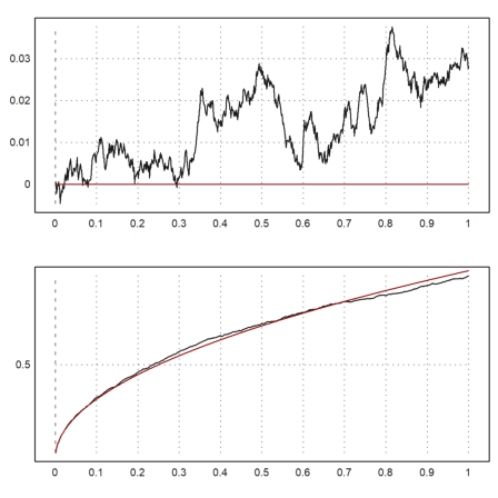
Since we can easily generate random walks, we can simulate the Wiener process. We take 1000 steps of 1000 processes. We then plot the standard deviation and the mean of the n-th step of these processes together with the expected values in red.
>n=1000; m=1000; M=cumsum(normal(n,m)/sqrt(m)); ...
 t=(1:n)/n; figure(2,1); ...
 figure(1); plot2d(t,mean(M')'); plot2d(t,0,color=red,>add); ...
 figure(2); plot2d(t,dev(M')'); plot2d(t,sqrt(t),color=red,>add); ...
 figure(0):
Tests are an important tool in statistics. In Euler, many tests are implemented. All of these tests returns the error that we accept if we reject the zero hypothesis.
For an example, we test dice throws for uniform distribution. At 600 throws, we got the following values, which we plug into the chi-square test.
>chitest([90,103,114,101,103,89],dup(100,6)')
0.498830517952
The chi-square test also has a mode, which uses a Monte Carlo simulation to test the statistics. The result should be almost the same. The parameter >p interprets the y-vector as a vector of probabilities.
>chitest([90,103,114,101,103,89],dup(1/6,6)',>p,>montecarlo)
0.526
This error is much too large. So we cannot reject uniform distribution. This does not prove that our dice was fair. But we cannot reject our hypothesis.
Next we generate 1000 dice throws using the random number generator, and do the same test.
>n=1000; t=random([1,n*6]); chitest(count(t*6,6),dup(n,6)')
0.528028118442
Let us test for the mean value 100 with the t-test.
>s=200+normal([1,100])*10; ...
 ttest(mean(s),dev(s),100,200)
0.0218365848476
The function ttest() needs the mean value, the deviation, the number of data, and the mean value to test for.
Now let us check two measurements for the same mean. We reject the hypothesis that they have the same mean, if the result is <0.05.
>tcomparedata(normal(1,10),normal(1,10))
0.38722000942
If we add a bias to one distribution, we get more rejections. Repeat this simulation several times to see the effect.
>tcomparedata(normal(1,10),normal(1,10)+2)
5.60009101758e-07
In the next example, we generate 20 random dice throws 100 times and count the ones in it. There must be 20/6=3.3 ones on average.
>R=random(100,20); R=sum(R*6<=1)'; mean(R)
3.28
We now compare the number of ones with the binomial distribution. First we plot the distribution of ones.
>plot2d(R,distribution=max(R)+1,even=1,style="\/"):
>t=count(R,21);
Then we compute the expected values.
>n=0:20; b=bin(20,n)*(1/6)^n*(5/6)^(20-n)*100;
We have to collect several numbers to get categories, which are big enough.
>t1=sum(t[1:2])|t[3:7]|sum(t[8:21]); ...
 b1=sum(b[1:2])|b[3:7]|sum(b[8:21]);
The chi-square test rejects the hypothesis that our distribution is a binomial distribution, if its result is <0.05.
>chitest(t1,b1)
0.53921579764
The following example contains results of two groups of persons (male and female, say) voting for one out of six parties.
>A=[23,37,43,52,64,74;27,39,41,49,63,76];  ...
   writetable(A,wc=6,labr=["m","f"],labc=1:6)
           1     2     3     4     5     6
     m    23    37    43    52    64    74
     f    27    39    41    49    63    76
We wish to test for independence of the votes from the sex. The chi^2 table test does this. The result is way to large to reject independence. So we cannot say, if the voting depends on the sex from these data.
>tabletest(A)
0.990701632326
The following is the expected table, if we assume the observed frequencies of voting.
>writetable(expectedtable(A),wc=6,dc=1,labr=["m","f"],labc=1:6)
           1     2     3     4     5     6
     m  24.9  37.9  41.9  50.3  63.3  74.7
     f  25.1  38.1  42.1  50.7  63.7  75.3
We can compute the corrected contingency coefficient. Since it very close to 0, we conclude that the voting does not depend on the sex.
>contingency(A)
0.0427225484717
Let us demonstrate how to read and write a vector of reals to a file.
>a=random(1,100); mean(a), dev(a),
0.521542031668
0.279035800623
To write the data to a file, we use the function writematrix().
Since this introduction is most likely in a directory, where the user has no write access, we write the data to the user home directory. For own notebooks, this is not necessary, since the data file will be written into the same directory.
>filename=userhome()|"test.dat";
Now we write the column vector a' to the file. This yields one number in each line of the file.
>writematrix(a',filename);
To read the data, we use readmatrix().
>a=readmatrix(filename)';
And remove the file.
>fileremove(filename);
>mean(a), dev(a),
0.521542031668
0.279035800623
The functions writematrix() or writetable() can be configured for other languages.
E.g., if you have a German system, your Excel needs values with decimal commas separated by semicolons in a csv (comma separated values) file. The following file "test.csv" should appear on your desktop.
>filename=userhome()|"Desktop\test.csv"; ...
 writematrix(random(5,3),file=filename,>comma,separator=";");
You can now open this file with a German Excel directly.
>fileremove(filename);
Sometimes we have strings with tokens like the following.
>s1:="f m m f m m m f f f m m f";  ...
 s2:="f f f m m f f";
To tokenize this, we define a vector of tokens.
>tok:=["f","m"]
f
m
Then we can count the number of times each token appears in the string, and put the result into a table.
>M:=getmultiplicities(tok,strtokens(s1))_ ...
   getmultiplicities(tok,strtokens(s2));
Write the table with the token headers.
>writetable(M,labc=tok,labr=1:2,wc=8)
               f       m
       1       6       7
       2       5       2
Next we use a variance analysis (F-test) to test three samples of normally distributed data for same mean value. The method is called ANOVA (analysis of variance). In Euler, the function varanalysis() is used.
>x1=[109,111,98,119,91,118,109,99,115,109,94]; mean(x1),
106.545454545
>x2=[120,124,115,139,114,110,113,120,117]; mean(x2),
119.111111111
>x3=[120,112,115,110,105,134,105,130,121,111]; mean(x3)
116.3
>varanalysis(x1,x2,x3)
0.0138048221371
This means, we reject the hypothesis of same mean value. We do this with an error probability of 1.3%.
There is also the median test, which rejects data samples with different mean distribution testing the median of the united sample.
>a=[56,66,68,49,61,53,45,58,54];
>b=[72,81,51,73,69,78,59,67,65,71,68,71];
>mediantest(a,b)
0.0241724220052
Another test on equality is the rank test. It is much sharper than the median test.
>ranktest(a,b)
0.00199969612469
In the following example, both distributions have the same mean.
>ranktest(random(1,100),random(1,50)*3-1)
0.127932482268
Let us now try to simulate two treatments a and b applied to different persons.
>a=[8.0,7.4,5.9,9.4,8.6,8.2,7.6,8.1,6.2,8.9];
>b=[6.8,7.1,6.8,8.3,7.9,7.2,7.4,6.8,6.8,8.1];
The signum test decides, if a is better than b.
>signtest(a,b)
0.0546875
This is too much of an error. We cannot reject that a is as good as b.
The Wilcoxon test is sharper than this test, but relies on the quantitative value of the differences.
>wilcoxon(a,b)
0.0296680599405
Let us try two more tests using generated series.
>wilcoxon(normal(1,20),normal(1,20)-1)
0.0261110211933
>wilcoxon(normal(1,20),normal(1,20))
0.52975950705
Linear regression can be done with the functions polyfit() or various fit functions.
For a start we find the regression line for univariate data with polyfit(x,y,1).
>x=1:10; y=[2,3,1,5,6,3,7,8,9,8]; writetable(x'|y',labc=["x","y"])
         x         y
         1         2
         2         3
         3         1
         4         5
         5         6
         6         3
         7         7
         8         8
         9         9
        10         8
We want to compare non-weighted and weighted fits. First the coefficients of the linear fit.
>p=polyfit(x,y,1)
[0.733333333333, 0.812121212121]
Now the coefficients with a weight that emphasizes the last values.
>w&="exp(-(x-10)^2/10)"; pw=polyfit(x,y,1,w=w(x))
[4.71566356925, 0.383190230089]
We put everything into one plot for the points and the regression lines, and for the weights used.
>figure(2,1);  ...
 figure(1); statplot(x,y,"b",xl="Regression"); ...
   plot2d("evalpoly(x,p)",>add,color=blue,style="--"); ...
   plot2d("evalpoly(x,pw)",5,10,>add,color=red,style="--"); ...
 figure(2); plot2d(w,1,10,>filled,style="/",fillcolor=red,xl=w); ...
 figure(0):
The following is a test for the random number generator. Euler uses a very good generator, so we need not expect any problems.
First we generate ten millions of random numbers in [0,1].
>n:=10000000; r:=random(1,n);
Next we count the distances between two numbers less than 0.05.
>a:=0.05; d:=differences(nonzeros(r<a));
Finally, we plot the number of times, each distance occurred, and compare with the expected value.
>m=getmultiplicities(1:100,d); plot2d(m); ...
   plot2d("n*(1-a)^(x-1)*a^2",color=red,>add):
Clear the data.
>remvalue n;
There are some more examples in the examples directory of Euler.
Examples/Black Swan Distribution
Examples/US Population Forecast
Examples/Sunspot Data
Examples/Econometrics
Examples/Benfords Law